Pages

Monday, August 15, 2011

vacation card #3


There are 10 of us sharing a 200 year old house on the coast of Rhode Island this week.  Three couples who go back 25 years and 4 exuberant kids ranging in age from 3-10.  Another rainy day has not kept us in the house.  Two walks to the beach and a long trip to the playground later and everything I brought is wet, but life is good.  I've been working my way through all the great artists participating in paint party friday, I finally wrote about my color experiment for the street team, I took a nap, rode my rip-stick all around the playground, and made this little collage.  I LOVE vacation.

I took some of yesterdays Neocolor experiments and combined them into today's card.   The background card had an aborted sketch of a hibiscus with a particularly obscene stamen which I have covered up.  I ripped another colored card and a white card and glued them down.  Painted over a piece of newspaper I was using to test my black Sharpies, ripped it out and glued it down.  Cut out little spiral patterns from my gum wrappers and glued them down and then drew over them with more Neocolors and Sharpies.  I found dozens of strange plastic mesh circles washed up on the beach.  (Our little private cove is home to all kinds of strange flotsam and jetsam. The less romantic in our group just calls it trash).  I took a few back to the house and used them with my black ink pad to stamp the little grid pattern in various places.  I added a few more circles with a white Sharpie paint pen.

It's very fun to "make do" and see what I can make.  It's a good reminder that you don't need every new fancy product to make art.  Heck, if I was feeling REALLY brave I wouldn't have packed anything and figured out how to make are with a pencil.  (imagine that).

We planned to spend this rainy day drawing with crayons on hot rocks from the beach but the oven died last night.  I'm really really hoping to find our landlord tomorrow so we can get the oven working again.  Hot rocks are SO much fun and we've been waiting since last August to do it again.  Plus my plan for scones with every meal has been thwarted after the first batch Sunday morning.  Had to settle for homemade pancakes today :)

More fun tomorrow - with or without an oven.

What is the color of more lost time?

It's crusade time again!  Last month we mixed and named our own colors.  This month Michelle challenged us to name the color first.  I knew right away that the name of my color would be "more lost time".

More Lost Time is the name of my husband's terrific podcast and blog.  He recently asked me to create an orignal piece of artwork to use as a banner for his blog.  I want to make something meaningful and unique - without too much literal imagery, and with a personal connection.  

Michelle's challenge was a perfectly timed starting place.  

To me, "lost time" isn't about time wasted, it's about time suspended.  The feeling of being so completely absorbed in a task that you lose all sense of time passing.  Orange is the color that immediately came to mind when I thought about more lost time.


I've been using lots of orange in my artwork this summer, and art is the number one way to suspend time.  I step into the studio and time stops.

My all-time favorite chair is orange.  It's huge, and overstuffed, with a giant matching ottoman.  I can read, nap, and even work in it for hours.  It's surrounded by books and has a handy spot for a cup of coffee or a glass of wine.  I'm usually joined by a cat or two.  It's one of the best places in the house to lose time.

My essential sleeping pillows are also orange and my lovely bed is another place time gets lost


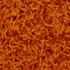
The more I thought about this color association, the more images kept coming to me.  For my entire childhood, our basement was covered in wall-to-wall orange shag carpeting like this one.  I spent countless hours on that rug, and many of my best memories have that fuzzy orange backdrop.  Is there any time more "lost" than childhood?

So CLEARLY orange is the color of more lost time.  But not just any orange.  I scanned the many hues of orange paint I own and none of them were right.  Time to mix my own!


I started with five blobs of terracotta paint, and mixed in 5 different shades of orange.  

The scarlet mix and the vibrant orange mix had the most promise, but weren't right on their own.  I decided to keep mixing.  I add glazing medium to the vibrant orange mix and painted that on top of the scarlet mix.  It was interesting, but not quite right.  So I added glazing medium to the scarlet mix as well and then reversed the layers.   Perfect!

THIS is the color of more lost time.


Thanks to Michelle Ward for another fun crusade.  Hop on over to the GPP Street Team to see what other fabulous colors have been created this month and to play along with the other crusaders.

Sunday, August 14, 2011

vacation days 1 & 2

Saturday was our first day of vacation, but we couldn't check into our rental house until late in the day.  I'm an early riser and had packed, gotten a haircut, and read all the blogs I follow before 10AM.  What to do with the next six hours?  Clean the studio, and then make a big new mess!  I hadn't painted big in months, so I had a wonderful time working fearlessly on my big watercolor pad.  Totally forgot to take pictures.  Didn't even think of making an index card while all that paint was flowing.  Instead I periodically posted ridiculous status updates on Facebook and then it was finally time to leave.

Hours later, kids in bed, wine consumed, ready for sleep - realize I didn't make an index card.  I thought about bagging it since I made four yesterday, but now I'm almost superstitious about making one every day.  Instead of making art, I decided to just recreate the day's facebook updates with my glaze pens.  (pardon the lousy image quality - no scanner and poor light in the house)
 

I could't fit all my goals on one card so I made two cards.  This was the point in the day when I was getting particularly giddy with the "hurry up and wait" aspect of getting ready to leave and my status updates reflected it. 


Today is day two of vacation - it's been cloudy with intermittent rain.  Twice we've dodged the raindrops and walked to our rocky little beach at the end of the lane.  Here's the card I made after our morning excursion - neocolor background and actual beach rocks:

 
I've had this tin of neocolors forever.  I bought them when I was a toddler teacher because I read somewhere they made good face paints.  Must have used them around Halloween.  They still bear the price tag from the University of Washington book store, and I moved away from Seattle in 1998 so I know they are at least 13 years old. I've recently started using them in my art, but I've never fully explored what they can do.  I spent some time messing around with them today, coloring on index cards and then painting over them with water.  (LOVE that Niji waterbrush!)


This was so much fun and I can't wait to keep playing with them.  I like how portable they are, now relatively non-messy they are, and how they still work like paint when wet.  Why did it take me so long to experiment?  Nothing like restrictions to force you in new directions.  Tomorrow I think I will cut up some of these experiments and layer them into a collage.  Stay tuned!

Saturday, August 13, 2011

Friday Paint Party

I'm going on vacation tomorrow and don't plan to pack any paints.  My index cards might be limited to pens and markers for a week.  Instead of packing tonight, I had a big old paint party, knowing I've got a paintless week ahead.

Here are four index cards using a variety of lovely, messy paint and ink.  Can I last a week without you?  We'll see how my packing resolve holds in the morning.  Maybe I can sneak a few small bottles into the suitcase....


Thursday, August 11, 2011

Index card experiments with mixed results

After the series of cards that made me really happy, I got into a funk.  Five cards in a row in the same style was feeling like a rut but it's not like inspiration was oozing out of every pore.  I was having cynical "what's the point" days.  Nothing was clicking.  I'm trying to embrace this as part of the process.  I don't have to love everything I make.  I can value what I learned from making them.  

I am so full of rules and standards for myself.  It's hard to "settle" for something I don't like.  I've been trying to avoid the "tomorrow's index card must be better than today's index card" trap.  But the longer I do this, and the happier I am with my work in general, the harder it is to accept what I deem lousy, or ordinary, or uninspired.
Each night, I forced myself to stop and accept the card as finished.  I scan it and post it to flickr right away before I have a chance to change my mind.


Leftovers

I used to hate leftovers. Whatever I ate for dinner was fine, but the passage of time and process of reheating did my food no favors. As I became a better cook, I discovered my leftovers were much more appetizing. Over the years I also learned to incorporate yummy leftovers into an even yummier dish the next day. (Have you ever made risotto cakes with leftover risotto? Makes me drool just thinking about it.)  Now I cook extra of everything, just so I can have the leftovers.

Lately, the leftover concept is starting to work in the art studio as well. The scraps and overflow from one project keep finding their way into other projects, often with better results. Last night is a good example. I was working on a swap-bot project with frequent interruptions from my insomniac son.  I hate to waste paint and acrylic paint dries fast, so every time I needed to walk away from the table I would smear my extra paint onto an index card or scrap of paper.  Many hours and interruptions later, I am done with my swap, but realize I haven't made an index card for the day.

In a moment of inspiration, fueled by an almost hallucinatory exhaustion, I assembled a variety of leftovers into one of my all-time favorite cards:


I had smeared red paint on an index card and a book page.  I had smeared a homemade blue glaze on another book page and on the red index card.  I ripped and cut the book pages into these shapes, glued them in place and applied black sharpie and white gel pen.  Such simple ingredients, really.  And like all simple ingredients, they can be combined in endless ways.

This piece inspired a series of index cards over the next several days.


Sunday, August 7, 2011

Traveling Art Journal - words of strength and encouragement

The second traveling art journal I worked on yesterday came from Laura Harms. Her theme is "Words of Strength and Encouragement". Here's the page I made:
The journal is a 5"x8" sketchbook with pages meant for drawing. I added so much paint, glue and extra paper that the page started to buckle! Luckily, Laura encouraged us to "Thickify" the pages (love that word!) so I hope she won't mind.

The words are something I heard Jane Davenport say in the class she teaches for "21 Secrets". I was watching her video and she sort of casually says "be gentle with your expectations" and it resonated with me so much that I stopped the video and got up to find a scrap of paper and pen so I could write it down before I forgot. It's been tacked on my bulletin board above my work table for months. It's such a lovely reminder to be kind to ourselves in the creative process.

These two journals will be lovingly packed and shipped to Maria on Monday. Can't wait for the next one to arrive!