Pages

Wednesday, April 17, 2013

Where do mail geeks go on vacation?

The National Postal Museum, of course!

It's Max's spring break and we are visiting my sister in Northern Virginia.
Today I went to the fabulous postal museum in Washington DC and couldn't resist posing with Mr. Zip.

By the time I get home I will have missed six days of mail.
I'm having withdrawal symptoms.

Thankfully I brought an absurd amount of art supplies, and since my sister conveniently has a paint-encrusted folding table in her basement, I made myself at home.

 My primary art-mission of the week was to finish a series of canvasses she commissioned several months ago.  One pleasant evening later, and here they are hanging on her wall:
(each one is 5"x7")

It's funny to me that she orients them horizontally, when I created them vertically.
It's all in the eye of the beholder, as they say.
Here are close-ups of all three pieces, oriented the way I see them.


With this mission accomplished, I spent quite a few glorious hours exploring lesson 1 of my Jane Davies Extreme Composition class.  The assignment involved exercises with line, the relationship of line to itself, to other lines, to the page, and to the background.
I made dozens of studies.
(here they are piled up on my sister's kitchen table)


I am LOVING this class so far.
After the various exercises in the lesson, I created this series using a "vocabulary" selected from my studies.


 I could happy continue to explore these exercises for weeks to come.  In fact, maybe I'll do just that while my sister is at work tomorrow.

This has been a wonderful vacation.
Some people want tropical beaches or European cities, but I can't imagine anything better than this: laughing until I cry with my family, long hours of art making, and a national love letter to the postal system.

Saturday, April 6, 2013

Can't resist

Have you checked out Kristin's tutorial try-out series?
Last week the tutorial to try was using glue as a resist.

For my first attempt, I grabbed a bottle of Elmer's gel glue and  drew this mandala-type thing (free hand, not much thinking or planning).  I let it dry overnight and then added some color with pan pastels and spray inks.  It resisted the color pretty well and though you can see where my unsteady hand dripped or dragged the glue, the gel glue really held a clean line and didn't ooze all over the paper after I doodled with it. Now that it's dry, the glue has a raised, slick texture. 

 These next two were made by sponging Mod Podge through a stencil.  The first one was a lighter/slightly uneven application of the glue.  Once dry, I used red acrylic paint over it and it wasn't resisting very well.  I spritzed it with some water while the paint was still wet and gave it a good scrape with a stiff card and then the white squares were more visible.
 I used more glue on this next one, and I watered down my paint before applying it and the resist was much more obvious.  I used a sponge brush to apply the glue and it dried nice and flat without much texture.

For this next one I brushed Mod Podge over a hand carved stamp and pressed it on the paper.
It was a little hard to get just the right amount of glue and to keep it from smooshing around too much while I stamped it, but it did a great job resisting the acrylic paint.

Here's another attempt at brushing glue on a stamp.
Less glue = less smooshy, but also a more subtle resist.
  

This next one was done by dipping various size bottle caps and jar lids in Mod Podge and stamping with them.  The circles are slightly raised.  I like the way this one turned out.


 This next one is just glue stick smeared at random.  I applied pan pastels after it dried and it looks a bit like a stormy sky.

I was on a roll, so I decided to see what would happen if I drew something with hot glue.
It certainly acted as a resist, but the cloudy hot glue over the boring white paper didn't do much for me.  I ended up rubbing gold all over the raised bits and around the edges.


I tried the hot glue again, but this time I used some patterned paper underneath, hoping it would look cool showing through the glue.  After the glue dried, I painted around it with gesso, and then used pan pastels to add layers of color over that.  The paper sort of shows through the glue (the raised glue swirls have no paint on them - the bluish green color is the background showing through).
I added doodles with gold sharpie and a fine point black pen.
I think I'll send these two to Gina for her Resident Mail Art project, since many of the residents have low vision and appreciate high contrast and/or textured art.  

All of this gluing reminded me of a technique involving drizzled rubber cement and water colors.  I drizzled, I let it dry, I painted, I sprinkled salt while the paint was still wet, I let the whole thing dry then rubbed off the salt and rubbed off the cement.  I'm thinking of doing this with my summer camp kids this year so I made this with super bright liquid watercolors as a fun sample.

So now I have a stack of resist backgrounds - what the heck will I do next?
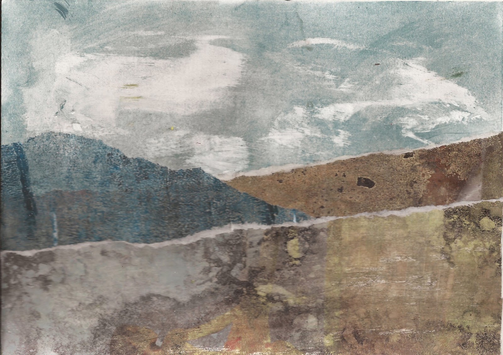
The messy glue stick sky inspired this landscape made with "citra solv" magazine pages, and gelatin printed deli sheets.

I cut up the red squares and the black stamp shapes to make this collage.  I added some metal fake
gears and used the stamp again to emboss that silver shape at the bottom. 

I used the orange circle background for this little collage, inspired by the stamps that came on an envelope from Jez this week.
(purple textured scrapbook paper and a green gelatin print of a leaf)


 And if you're not completely tired of resist techniques, let me show you one more.
Kristin's first week of "tutorial try-outs" featured this Vaseline resist technique from Julie Fei-Fan Balzer.

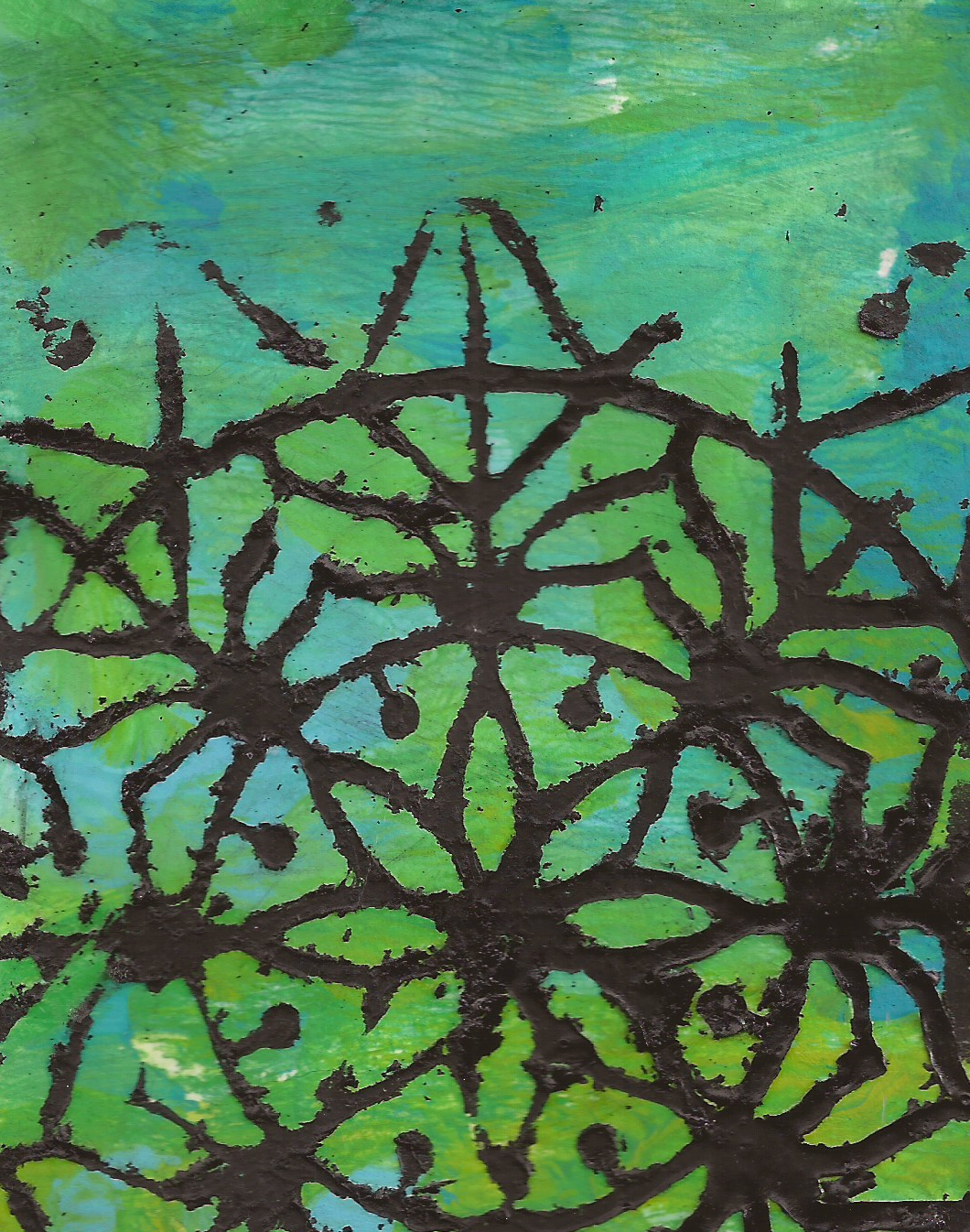
I grabbed a stencil, laid it on some white card stock, smeared a heavy layer of Vaseline through it, lifted the stencil and painted all over the paper (and Vaseline) with a mix of blue/green/yellow acrylic paint.  When it was dry I wiped off the Vaseline.
It looked cool and left some pretty crisp lines showing, but since I have a hard time visualizing "positive" and "negative" space, I couldn't really see how this was different from just using my stencil the regular way.
So I laid the stencil over the painted background and used black paint over the stencil, like so: 
   
Finally, I had to give the Vaseline one more shot.  I put the stencil over the painted background, rubbed on the Vaseline again, peeled off the stencil and this time painted black paint just on top of the Vaseline, not all over the page.  It got a little muddy in places, but still looked kind of cool.
Overall, this was not as messy as I assumed it would be, and didn't leave the paper as greasy as I thought it would.  It was pretty fun.

Here's how I pulled all three together of the above prints into a postcard.  The white and black images were overlapping on the original paper, so I judiciously cropped the page to 4x6 and then cut out the black Vaseline shape and glued it on top.
Fun stuff!

Many thanks to Kristin for hosting this little party, pointing out these great tutorials and inspiring me to try something new.  I can't wait to try out this week's tutorial!

Monday, April 1, 2013

I won! I won! I won!

I won a spot in Jane Davies' Extreme Composition class.
Could you hear me squealing with delight just a few minutes ago?

I love Jane's work.
I took her "keys to dynamic composition" class last year and got a lot out of it.
I want to be able to paint like Jane, without making paintings that look like Jane's.

Here are four Jane-inspired postcards I made last week.


Class starts Wednesday.
I'm so excited!

Saturday, March 30, 2013

Spam is good for something after all


Saturday night.
Almost midnight.
House to myself.
Stones cranked.
Laughing maniacally.
Spam comments will never be cursed again.

Friday, March 29, 2013

Tutorial Try-Out: Abstracted flowers

The lovely Kristin Dudish has been hosting a weekly series called “Tutorial Try-Outs"
You know all those tutorials you come across and bookmark “for later” and never get around to trying?  Kristin is committed to trying one new technique per week and inviting others to play along.

This week’s challenge is Carla Sonheim’s abstracted flower tutorial. The directions are very straightforward and easy to follow and I had no trouble achieving results similar to Carla’s.  But that’s the problem – they look too much like Carla
I want them to look like me! 
(I painted on one big sheet of paper, then cut it into four postcards, and tried to add a color wash to the top postcard but it just smeared all the pencil marks and made a mess)
 
I often feel like my brain is too literal – I can’t figure out a way to do this without actually doing this.  While I ponder that conundrum, I have at least taken the step of cutting apart my work and gluing it back together in layers.
 I also took a few different hand-carved stamps and using grey and black ink, stamped some flowery shapes on top.

 
The technique was really fun, even if I'm not wild about my results.
I may have to mess around with this one some more and see where it takes me.
 
Have any of you tried this one yet?
If you do, be sure to hop over to Kristin's blog to link your work and check out the cool thing Kristin did with her flowers!

Tuesday, March 19, 2013

365 Collage Project update

It is the 78th day of 2013 and so far I've made 77 collages.
I'm right on track for making 365 collages in 2013.
I'm feeling rather pleased about the whole thing.

This first batch was created exclusively with the wonderful papers Lorinda sent me as part of our collage fodder exchange.


I tried a monochromatic purple from her papers because I'm part of an upcoming purple swap.
It's my least favorite of the bunch.

I raided my own stash and ended up with this riot of purple instead:

I'm also part of a monochromatic orange swap:
 

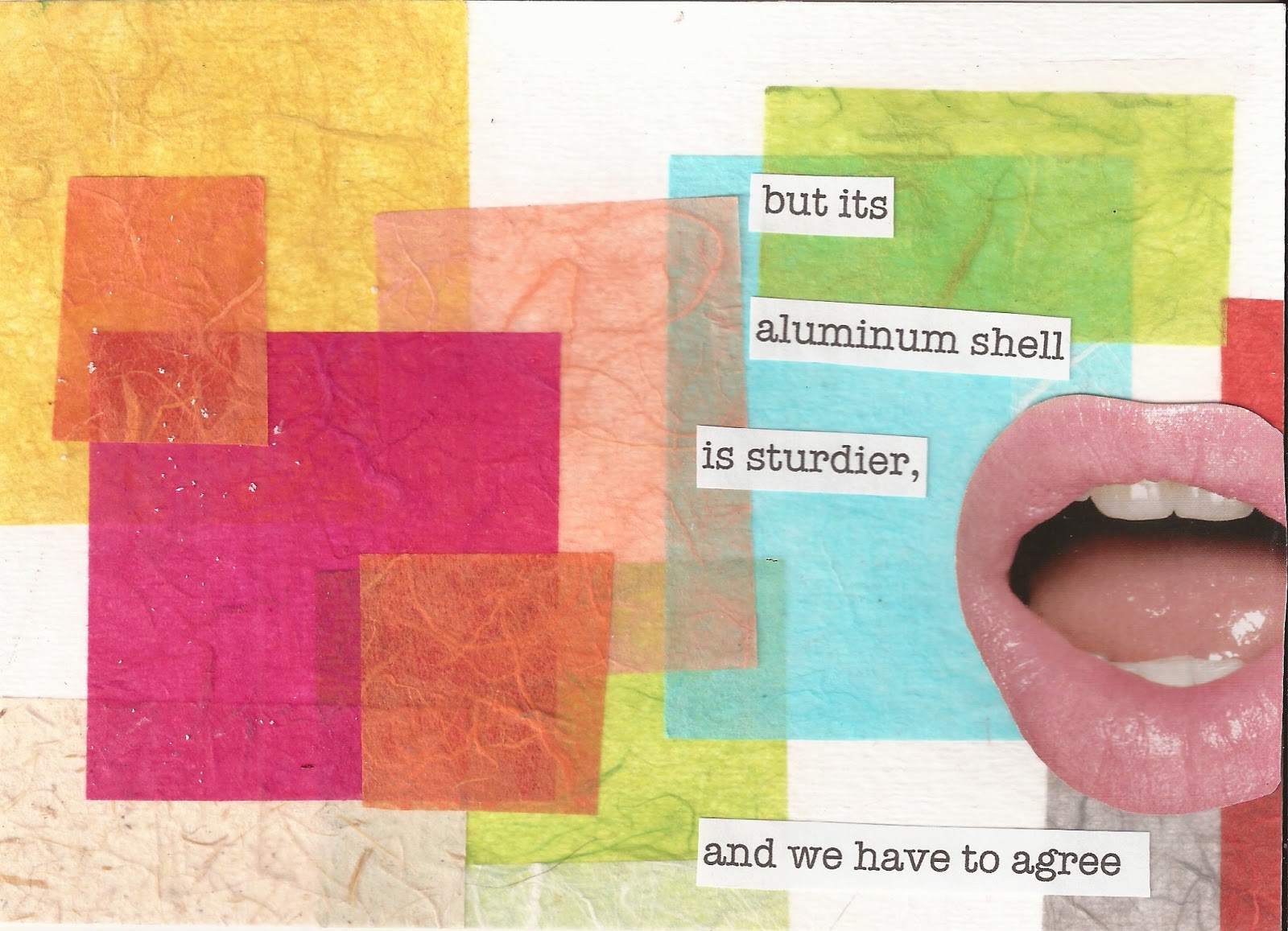
and since I've been really enjoying limiting my resources, I decided to make some postcards using this collage sheet from Lee:
 Lee put the sheet together for a Mail Me Some Art challenge.
The rules are to make postcards using only the images from the sheet.  You can re-size, duplicate or otherwise alter the images and add your favorite art supply, but you can't use any outside pictures.
Here's my take on the challenge:


For this next one, I had greatly enlarged the label for "cape cod cranberries" and didn't know what to do with it.  I thought about cutting up the letters to make new words, and decided I'd get some help form an on-line anagram maker.
Who knew that the letters in "cape cod cranberries" would also spell "creep in, sacred cobra?"

I thought I was done with this challenge and went and had some dinner.
When I came back to the art room there were still quite a few unused bits from all the sheets I'd printed.  Among the bits, lots of letters, and me with the anagram maker at my disposal.
Andrew R. Titus became "Tawdrier Nuts"
 and James L. Titus became "Lustiest Jam"

Can you hear my peals of laughter?
God, I crack myself up.

If you want to have your own fun with Lee's collage sheet, head over to Mail Me Some Art, print the sheet, join the swap and get your postcards in the mail by April 15th.