This week's lesson in the Jane Davies class was about shape.
It's hard not to create Jane-like work after watching her demos, particularly because I love her style so much.
Here are some stacked shapes like Jane's, done mostly with the gelli plate.

and then because they look like stones, and I love stones, I went off on a stone-printing tangent and almost got stuck there for the weekend.


I could experiment with this process for the rest of my life.

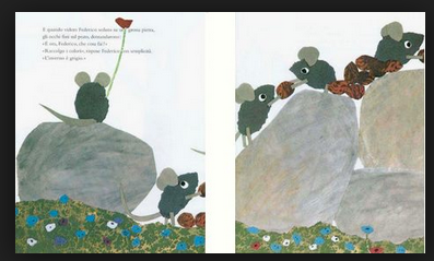
Plus, they remind me of the Leo Lionni book "Frederick" and what's not to love about that?
But I grudgingly tore myself away from this so I could focus on the class assignment.
It's tempting to just show you the pieces I like

and pretend the dozen weird and ugly pieces don't exist

 |
| (I really don't know what happened here) |

But it's all part of the process, and kind of the point of the class. Make a ton of work, and make it on cheap paper so it doesn't feel precious. Try things, leave them unfinished, take them too far, make some more.
Here are some I don't love, but don't totally hate:

(except that big green shape reminds me of an Android)


And here are some that more or less please me:


As always, just as I start to hit my stride it's time for a new lesson.
I wonder what tomorrow will bring?
Love love love. Love the stones, and your sense of humor, and Leo Lionni.
ReplyDeleteAmazing, amazing work! Those "stones" really blow me away.
ReplyDeleteDon't you do a lot of mileage in this class! Love the stones. Gelli printing is addictive.
ReplyDeleteThese are cool and do look like some of Jane's work, which makes sense. My pal Connie took it and said she learned a ton, altho it was a lot of work. Glad you're having fun!
ReplyDeletesimply yummy!!!!!!! LOVE the maroon, orange, turquoise piece! All so much fun~
ReplyDeleteWonderful! I hope I can take this class at some point. Your 7th from the top (the blue and purple stack) reminds me of a series I did at Jane's VT workshop this summer. I'm looking forward to seeing more!
ReplyDeleteIt seems like your responses are much the same as mine when I took the class - some I really liked, most were 'meh' and some were just ugly. But, oh my, the process! I absolutely LOVED the process, the freedom, the challenge to make each new "cheap paper" creation different. What I found difficult however, was keeping the momentum after the class. I was flat worn out! :) I'm loving your work - see some of you and some of Jane in each of them....which is to be expected. Love the stones!
ReplyDeleteI hope I'll see your work in at least one MFA someday. Soon.
ReplyDeleteKaren, I like all of these, and especially like that you have read "Frederick" - one of my all-time favorite books!!
ReplyDeleteI love all of these!! Wonderful!!
ReplyDeleteJanet
WOw, a terrific amount of wonderful pieces! I just came across this blog piece and the timing's perfect as I'm headed to a Jane Davies Monoprint Collage workshop next weekend (Coupeville, WA, on WHidbey Island, next island over from where I live, Fidalgo Island).
ReplyDeleteThere is that bit that we tend to make work similar to the instructor's oftentimes, but yours definitely have a different take on many. I often think that especially in the world of art journals, there's a particular aesthetic that is massively widespread, especially in the way people do faces. I guess we just are influenced a lot by what's around us, not necessarily a bad thing. One thing I love about this group is the great variety of styles Thank you for creating this community!
Karen, this could be you. Hope to see your show some day soon.
ReplyDeletehttp://caterinagiglio.blogspot.com