I've been working with other people's papers lately, both through formal swaps and by digging through my basket of treasures I've received in the mail.
Rather than writing the longest blog post in history, I've decided to give you a week of different "use my stuff" projects.
First up, a Swap-bot trade with randomly assigned people I'm not familiar with.
Here's how the swap worked.
I sent an envelope of collage fodder from my stash to two different people and they sent me back a postcard they made with my stuff.
And of course I got two envelopes of stuff from two different people, and had to make postcards out of their stuff.
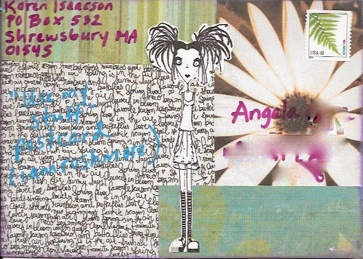
Here are the two postcards I made.
This first one was using Angela's stuff. It was really hard for me because she sent a lot of scrapbook paper and cutesy black and white rubber stamp images (which you know is not my thing at all. ) There was one page from an anatomy book which kind of saved the project for me.

I don't really like these at all, but I couldn't bring myself to make a more traditional scrapbook/stampy kind of card.
The next one used Cynthia's stuff. The envelope had a wide variety of stuff in it and was more fun to play with. The materials and colors are not things I would have chose for myself, but I like the end result slightly better.

Next are the two postcards I got in return.
It was
really fun to see what these people did because it was not at all how I would
have used the pieces.
This is what Amy made with my stuff:
And this is what Joyce made with my stuff:
None of these cards really look like my work, but it begs the question - which looks more like "me?" The ones I made with other people's stuff, or my stuff used by others.
Is my style more defined by technique or material?
Is my style more defined by technique or material?


Hmmm - have to say none of them particularly look like "you" but of them, the purple one seems to show a bit more of your aesthetic. I've decided to let swap bot go - I have plenty of other commitments and my results with those swaps have been pretty hit and miss.....
ReplyDeleteto my eye, your work still looks like your work just with a different palette. the elements from the others work are definitely more "you". so... technique FTW.
ReplyDeletefun exercise!
This comment has been removed by the author.
ReplyDeleteI think what you made using Cynthia's stuff looks the most like "you", especially compositionally. I love what you did with the cutesy scrapbook stuff. It's like The Walking Dead meets MoshiMonsters!
ReplyDeleteThat's a curly question...but my faves are the first of yours, and Joyce's.
ReplyDelete