Showing posts with label GPP Street Team. Show all posts
Thursday, March 29, 2012
Coulda Shoulda Woulda
It's Michelle Wards 61st and final Crusade over at the GPP Street Team. The theme was "restraining order" and the goal was to create a journal page with minimal elements. I've been meaning to do this all month. In fact I've been meaning to do the crusades just about every month for the last year, but have only managed to do a few.
So why am I jumping on the bandwagon at the 11th hour? Two reasons.
1. Tammy's creativity queue challenge has been a powerful motivating force to tackle those half finished projects and half baked ideas.
2. This blog might not exist if not for Michelle's crusades.
The page at the top is not particularly restrained. But if you look closely, you'll see it's dated 4/19/11, and on the right hand side it reads "discovered the Street Team challenges. I will need a blog or flickr to play along"
My journal entry 6 days later notes that "I am Rushmore is up and running with 11 posts" (I was so full of good ideas I did 11 posts at once and back dated them. If you look at my archives it looks like I've already celebrated my one year anniversary. Don't believe everything you read.)
And so, since words cannot express my gratitude for the motivation to stop making secret art, and start this little blogging adventure, I will say it minimally:
Saturday, November 26, 2011
Radio On
Here's some things you should know about me:
If I know the words to a song, I am obligated to sing it.
I know the words to everything.
I love to sing. I love to drive. I sing anywhere and everywhere, but my favorite place to sing is the car.
I grew up in the cassette era. I had a few dozen LPs, but mostly I had homemade cassettes of other people's LPs. They would pile up on the front seat of my 1983 Plymouth Reliant - alternately baking in the hot sun or freezing in the cold New England winters. This really took its toll on the sound quality of the tapes. It didn't bother me - who could hear the music over my singing? Ric says "Karen was lo-fi before it was cool to be lo-fi"I married Ric because
1. he has more records than anyone I've ever met
2. he never minds my singing
3. no one, in the history of humankind, makes better comp tapes
There are far worse reasons to get married.
We've been hanging out for 24 years now.
This month, Michelle Ward challenged the Street Team to document our favorite sing-out-loud songs. It was tempting to fill my list with oldies-but-goodies of the last 3 decades, but I wanted to capture some of my favorite songs RIGHT NOW. They may not be my favorite songs next year, or even next month, but they are what make me turn up the volume and howl along this week.
Of course I couldn't resist adding a few perennial favorites, so turn it up loud and sing with me now:
"I'm in love with Massachusetts. With the radio on"
Saturday, September 3, 2011
Crusade No. 55
Michelle Ward has done it again! This month's crusade is crazy-fun. Before you even read this you should just click on over to her site to see the challenge and her gorgeous work. Aren't you totally inspired? Don't you just want to play along?
(Okay, if you can't tear yourself away from my riveting blog long enough to check that out, here's the scoop: paint a background with 2-3 colors, paint a stamp with the same 2-3 colors. watch the way parts of the stamped image "disappear" when matching colors align.)
I decided I would simultaneously work on my new index-card-a-day challenge while working on the crusade. (because you KNOW I couldn't give up ICAD, so I've signed up to play along in September). Unlike my summer index cards, I'm going to follow Tammy's prompts in September because I think they might challenge me and keep me out of a style rut. The color theme of the month is red - a color I rarely use, so right off the bat I'm stretching. The topic theme is "paths" and the style theme is "curves".
So to start my crusade I lined up a bunch of index cards and worked with red and turquoise paint.
I got out my favorite swirly, curvy rubber stamp and applied the paint. Interesting, but I'm not sure I like these.
I tried it with 3 colors by adding some black:
Wild, but kind of ugly too....
Let's switch pallets and try red and orange.
In addition to the swirly stamp I'll use some big foam stamps I found on clearance and never use.
Better, but not enough contrast.
Let's add some black, and let's spray the background with water first to make it more splotchy....
Now let's stamp with red/orange/black
Cool! I'm loving these.
And I haven't tried stencils yet....
The results are interesting.
I even managed to pull an interesting mono print from the circle stencil before I lifted it off the background:
Time to switch pallets again. When I use red at all, I use it with black and grey.
These turned out to be my favorite of the whole bunch.
Instead of using my red craft paint on those I used my red Liquitex Basics. I like the way it's kind of shiny and semi transparent.
Now....which of these will I choose for my index card today? Surprisingly I went for one of the garish red/turquoise/black ones. Since the topic theme for September is "paths" I was picturing a path with a sign that says "This Way" - and that immediately made me think of the hilarious little bit from Dan Zane's version of the song "Side by Side" in which Dan and Father Goose get lost in the woods on the way to a party and fireflies come along to light up the way, and he introduced the most excellent word "bashment". (If you have children born in the last decade you might know what I'm talking about. Otherwise you'll have to take my word for it because I can't find any youtube clip of the song)
STILL reading this? Turn off your computer right now and run to your paint supply and play along with this month's crusade. If you don't paint (and I surely don't understand why you wouldn't) please follow the fireflies to the bashment. I hope they remembered to bring the snacks.
Monday, August 15, 2011
What is the color of more lost time?
It's crusade time again! Last month we mixed and named our own colors. This month Michelle challenged us to name the color first. I knew right away that the name of my color would be "more lost time".
More Lost Time is the name of my husband's terrific podcast and blog. He recently asked me to create an orignal piece of artwork to use as a banner for his blog. I want to make something meaningful and unique - without too much literal imagery, and with a personal connection.
Michelle's challenge was a perfectly timed starting place.
To me, "lost time" isn't about time wasted, it's about time suspended. The feeling of being so completely absorbed in a task that you lose all sense of time passing. Orange is the color that immediately came to mind when I thought about more lost time.
I've been using lots of orange in my artwork this summer, and art is the number one way to suspend time. I step into the studio and time stops.
My essential sleeping pillows are also orange and my lovely bed is another place time gets lost
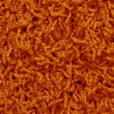
The more I thought about this color association, the more images kept coming to me. For my entire childhood, our basement was covered in wall-to-wall orange shag carpeting like this one. I spent countless hours on that rug, and many of my best memories have that fuzzy orange backdrop. Is there any time more "lost" than childhood?
I started with five blobs of terracotta paint, and mixed in 5 different shades of orange.
The scarlet mix and the vibrant orange mix had the most promise, but weren't right on their own. I decided to keep mixing. I add glazing medium to the vibrant orange mix and painted that on top of the scarlet mix. It was interesting, but not quite right. So I added glazing medium to the scarlet mix as well and then reversed the layers. Perfect!
THIS is the color of more lost time.

Thanks to Michelle Ward for another fun crusade. Hop on over to the GPP Street Team to see what other fabulous colors have been created this month and to play along with the other crusaders.
Saturday, July 16, 2011
Crusade No. 53
My story starts with this little envelope made from my hand-painted paper.
I love the green color in here, and haven't been able to figure out which paint color I used. I have lots of bottles of green paint, and whenever I use them I'm disappointed. They're just too GREEN.
I decided this particular green must be a blend of the blue and yellow paints I used, but which blue? which yellow?
just some of my paint bottles....Time to become the mad scientist! I chose the blues and yellows I thought were most likely to give me the magic blend and even added I few I was pretty sure wouldn't work, but I was being open minded.


Some systematic blending came next:
Then it was time to compare: DEFINITELY none of these!
This is getting closer:This could be the one!
What surprised me the most was the shade of yellow. It's the palest of all my yellows - almost pastel - and I color I rarely use. I tend toward the deepest, most vibrant almost-orange yellows (think school bus). This particular yellow is cool and pale - a little darker than butter, but not as bright as a lemon. I threw it in the mix in the spirit of open mindedness. Glad I did since it solved the mystery of the envelope green.
In honor of my new color, I created this journal page:

Happy crusading everyone!
Thursday, June 16, 2011
GPP Street Team - Crusade No. 52
The lovely Michelle Ward continues her evidence series with her latest Crusade “Seasonal Wardrobe”. She poses the question “Do you change the colors of your work palette with the seasons?”
It's an interesting thought, but I haven’t been doing this long enough to notice a pattern. I started thinking about my clothes and the palette shifts from winter to summer.
There are certainly consistencies – I wear a lot of black year round. I never wear red. I do not own a single pastel color. One thing I noticed is that my winter clothes are all solid colors and my summer clothes have more patterns. The cold New England winters (and my cold New England office) mean bulky sweaters October-April. I loathe patterned sweaters. I lived through the “Cosby” era and have had enough thank you very much.
So my winter palette tends to be shades of green with denim. Shades of black and grey, with denim. Maybe some rusty orange, or deep plum – with denim. Since I wear jeans almost exclusively these days, I don’t own any blue tops. (one of my rules – can’t wear blue with denim).
(winter uniform)
The hot, muggy New England summers (and lack of air conditioning at work) bring out the floaty skirts and light tops. I wear more hot pink in the summer. Pants are light colored, so I might sneak in a blue shirt once in a while. Skirts can and should be patterned, but pants can NEVER be patterned. (another of my many fashion rules!).
(summer uniform)
Does any of this carry over into my artwork? I don’t know yet, but in the spirit of collecting evidence for future study, I took a closer look.
My work table is always covered by paper. I work on it until it’s so covered in paint it’s distracting, and then roll another sheet of paper right over it.
I excavated through a few layers of paper to see what I could learn. I saw evidence of specific projects or temporary trends (i.e. I used that stamp on everything for about 2 weeks), but what drew my eye was the common color combinations. By looking at my blotter papers it’s clear I combine orange and pink a lot. I also use blue and black, and shades of green, sometimes mixed with yellow.
I cut pieces of blotter paper and glued them to "evidence tags" then went digging through my scrap pile for further evidence. I absolutely LOVE to paint papers. I have stacks and stacks of my experiments with marbling, paste papers, gelatin printing, acrylic inks, etc. The color trend continued here and I punched circles from the abundance of supporting evidence.
Here's the 2 page spread, followed by the details of each section.
It will be fun to look back at my journals in a few years to see how my palette shifts.
Subscribe to:
Posts (Atom)