It's crusade time again! Last month we mixed and named our own colors. This month Michelle challenged us to name the color first. I knew right away that the name of my color would be "more lost time".
More Lost Time is the name of my husband's terrific podcast and blog. He recently asked me to create an orignal piece of artwork to use as a banner for his blog. I want to make something meaningful and unique - without too much literal imagery, and with a personal connection.
Michelle's challenge was a perfectly timed starting place.
To me, "lost time" isn't about time wasted, it's about time suspended. The feeling of being so completely absorbed in a task that you lose all sense of time passing. Orange is the color that immediately came to mind when I thought about more lost time.
I've been using lots of orange in my artwork this summer, and art is the number one way to suspend time. I step into the studio and time stops.
My essential sleeping pillows are also orange and my lovely bed is another place time gets lost
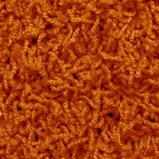
The more I thought about this color association, the more images kept coming to me. For my entire childhood, our basement was covered in wall-to-wall orange shag carpeting like this one. I spent countless hours on that rug, and many of my best memories have that fuzzy orange backdrop. Is there any time more "lost" than childhood?
I started with five blobs of terracotta paint, and mixed in 5 different shades of orange.
The scarlet mix and the vibrant orange mix had the most promise, but weren't right on their own. I decided to keep mixing. I add glazing medium to the vibrant orange mix and painted that on top of the scarlet mix. It was interesting, but not quite right. So I added glazing medium to the scarlet mix as well and then reversed the layers. Perfect!
THIS is the color of more lost time.

Thanks to Michelle Ward for another fun crusade. Hop on over to the GPP Street Team to see what other fabulous colors have been created this month and to play along with the other crusaders.


Karen - what a terrific narrative you provide for explaining your process! I loved being taken on a tour of the evidence of orange in your life and how you relate to each of those items with the concept for your color name. Then - the color mixing! I'm not sure I would have picked this color for More Lost Time until I heard you tell us you it represents an engaged mind that loses track of time....then orange seems like a lively, descriptive, perfect choice....especially for you. Well done! Thanks for sharing with the team!
ReplyDeleteKaren, this is a GREAT post! I love your artwork and the concept for the new banner. Thanks for sharing your process, too.
ReplyDeleteI love this post! This is a great term for those spaces when you're completely absorbed in something and don't realize time. I love the vibrant orange, but you are right...the flip and the glaze made it more powerful and rich.
ReplyDeletethat carpet! Memories!
Wow! You really put alot into this and it's a WONDERFUL color result! Here I am, always complaining about there not being enough time, but I want to get lost in lost time now! Yes, I like your outlook on it. And your paintings, with all the layers and textures, and gorgeous color combinations are stunning.
ReplyDeleteWonderful! I love your view of lost time, not wasted time.
ReplyDeleteThanks so much for sharing your process - it's fascinating to see how others think and process a project. And your color is truly delicious!
ReplyDeleteLooks like "More Lost Time" led to more exploration of your inner world where a lot of that lost time is well spent! Loved this explanation, loved the color and love that sleeping cat on the chair!
ReplyDeleteLove the bright orange - thanks for sharing your tale.
ReplyDelete